
Making Lingotune's song library feel discoverable
Product Design Intern · May – August 2025
Overview
Lingotune had a library of songs. Users thought it only had one.
Lingotune helps people learn languages through music, pairing songs with short lessons that make vocabulary and grammar easier to remember.
However, users arriving on the song selection screen often saw the first card and stopped there. The rest of the library technically existed, it just wasn't visible and intuitive.
In under a week, I redesigned the browsing experience, from a single static card to a browsable song library. The new interaction shipped in Lingotune's next release.
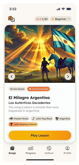
Before
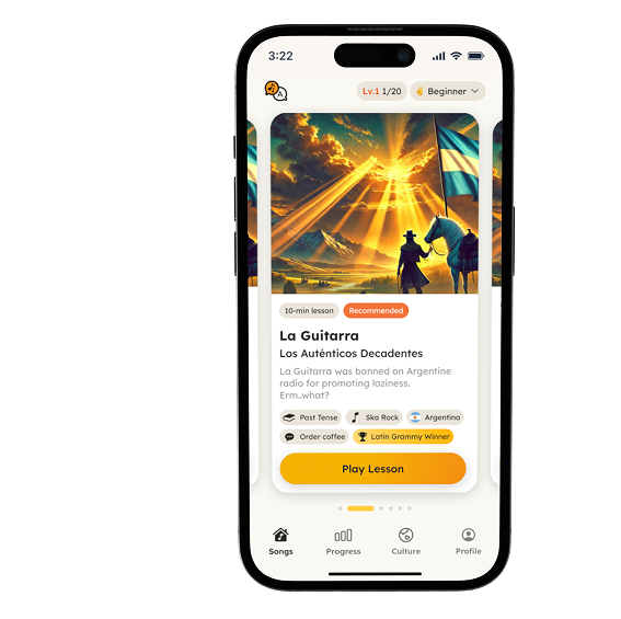
After
Problem
The interface showed a song, not a collection.
The original experience displayed one song card at a time, with small arrows for moving between options. Functionally, users could browse. Visually, almost nothing suggested that they should.
Reviewing and analyzing over 20 UXCam test sessions revealed two repeated behaviors:
Users tried to swipe
Before looking for another control, users tried to swipe the card horizontally, a gesture they already associated with browsing a collection on mobile.
Users stopped at the first song
When swiping did nothing and the arrows went unnoticed, many users didn't continue exploring. The screen looked complete, so the first card felt like the only available option.
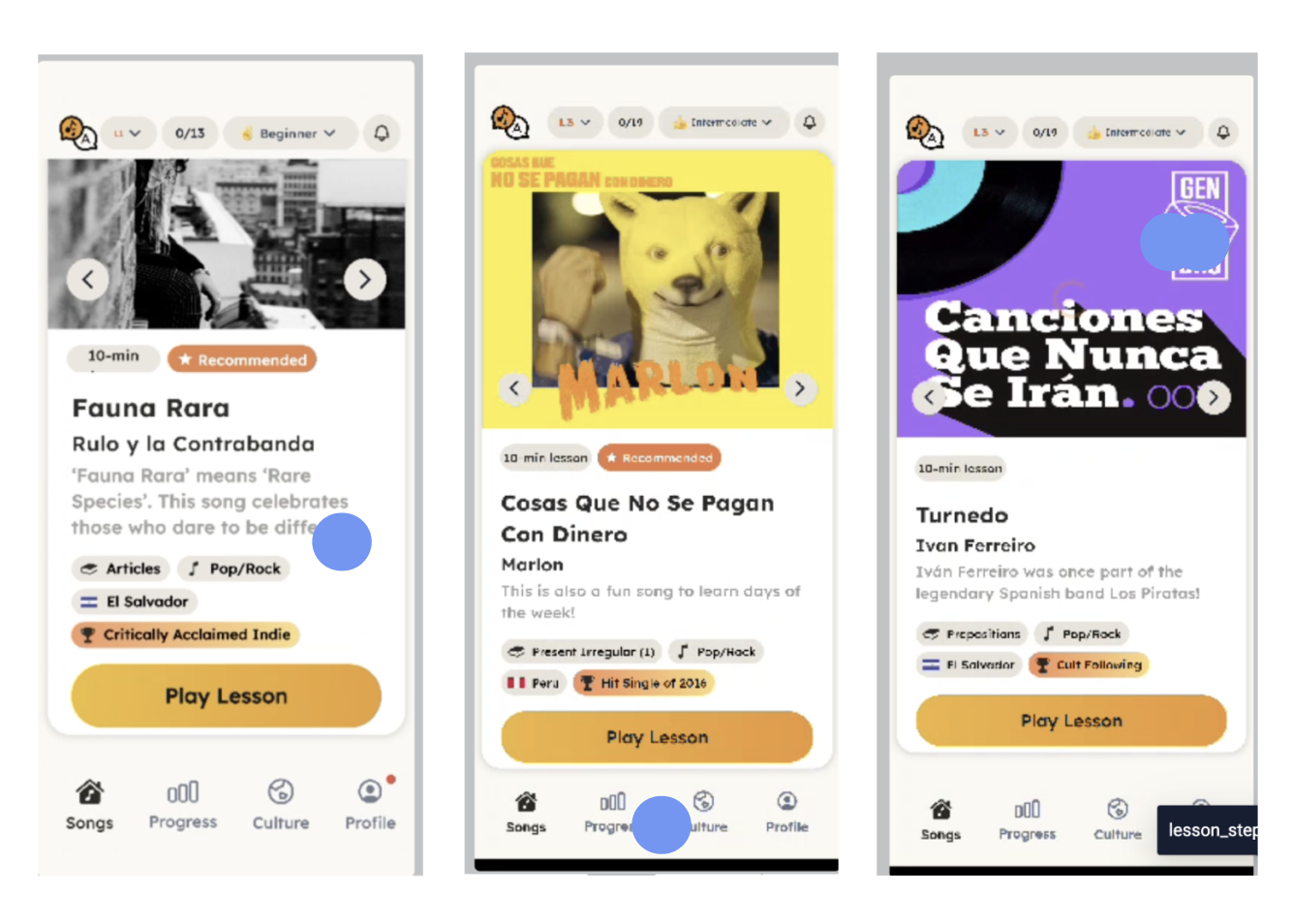
🤔 How might I make the library itself feel browsable?
Constraints
Improve discoverability without rebuilding the entire screen.
⏳ Under one week
Users were already running into the issue, so we needed a direction that could be designed, approved, and prepared for development quickly.
🎶 Keep the existing song cards
The cards and their content structure were already established. I needed to improve the way users moved between them without redesigning each card.
🗒️ Use the existing design system
The new interaction still had to feel native to Lingotune and remain realistic for the team to implement.
👤👤👤 Small team, quick decisions
I worked alongside another designer and the founder, which meant sharing early explorations, narrowing the direction quickly, and keeping the solution focused.
Exploration
I explored how much of the experience actually needed to change.
I quickly sketched three directions, from a small interface adjustment to a larger change in how songs were presented.
Make the arrows more prominent
This was the fastest change, but it still asked users to notice and learn a control they were already overlooking. It treated the symptom without fixing the screen's lack of discoverability.
Turn the library into a vertical feed
Showing several songs at once would make the library more visible, but it introduced another vertical browsing pattern into an already vertically scrolling page. Songs and page content would compete for the same gesture.
Use a horizontal carousel
A carousel preserved the existing cards, kept song browsing separate from page scrolling, and supported the swipe gesture users were already attempting.
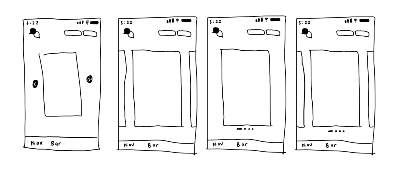
Decision
Instead of teaching users a new behavior, I designed around the one they already had.
I moved forward with the horizontal carousel because it addressed both sides of the problem: it made browsing feel familiar, and it made the existence of additional songs visible before users interacted.
How do users browse?
Swipe between songs.
How do they know there's more?
Show part of the next card.
How do they know where they are?
Provide lightweight pagination.
Solution
01 Make browsing feel immediate
Users could now swipe horizontally between songs, the same gesture I repeatedly saw them attempt in test sessions. This removed the need to find a separate control before exploring because the interaction matched what users already expected the card to do.
02 Let the next song enter the frame
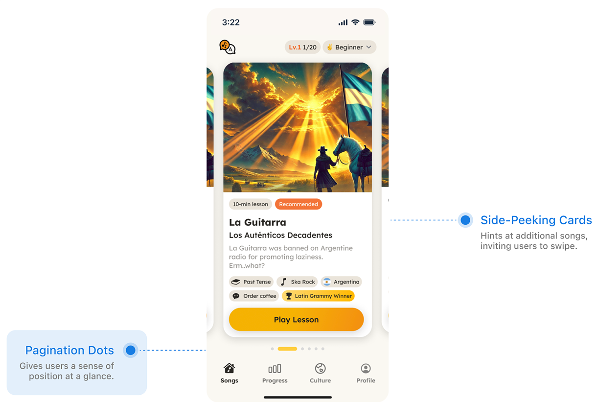
I exposed part of the neighboring card so the interface no longer appeared to end after the first song. Rather than relying on instructions or a more prominent arrow, the layout itself communicated that the library continued.
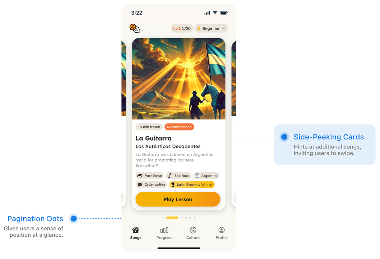
03 Give users a sense of progress
Pagination dots provided lightweight feedback as users moved through the library.
The side peeking cards answered "is there more?" The pagination dots answered "where am I?"
Outcome
From observed behavior to a shipped redesign, in under a week.
The team approved the direction, and the redesigned song browsing experience shipped in Lingotune's next release.
I didn't have access to post-launch analytics, so I can't claim a measured change in engagement. If I were evaluating the release, I would focus on three signals:
Browse depth
Are more users moving beyond the first song?
Lesson starts
Does exploring more of the library lead to more lesson selections?
Screen exit rate
Are fewer users leaving before choosing a song?

Reflection
Sometimes, the clearest design direction is already hiding in user behavior.
I entered the project thinking the navigation control needed to be fixed. Watching real sessions changed how I framed the problem: users didn't just need a better way to move forward — they needed to understand that there was somewhere to go.
This project reminded me that familiar interaction patterns are useful for more than usability. When used intentionally, they can also communicate what a product contains and what users can do next.
The behavior didn't need to be invented. It needed to be supported.